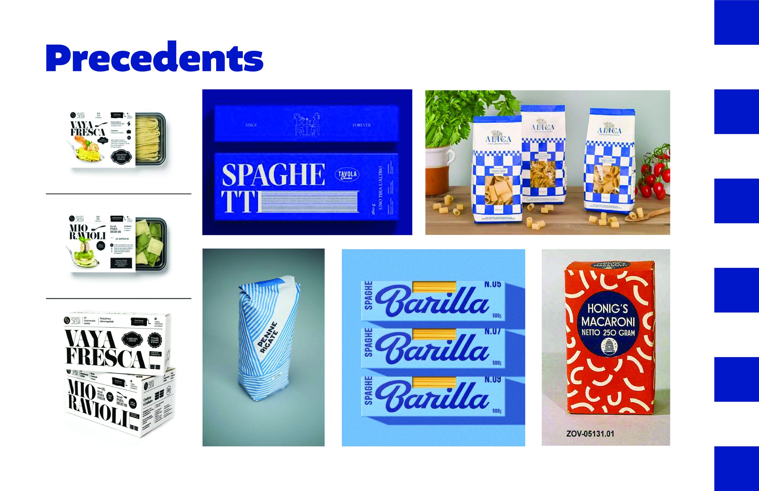
This project was a part of my Communication Design II course.
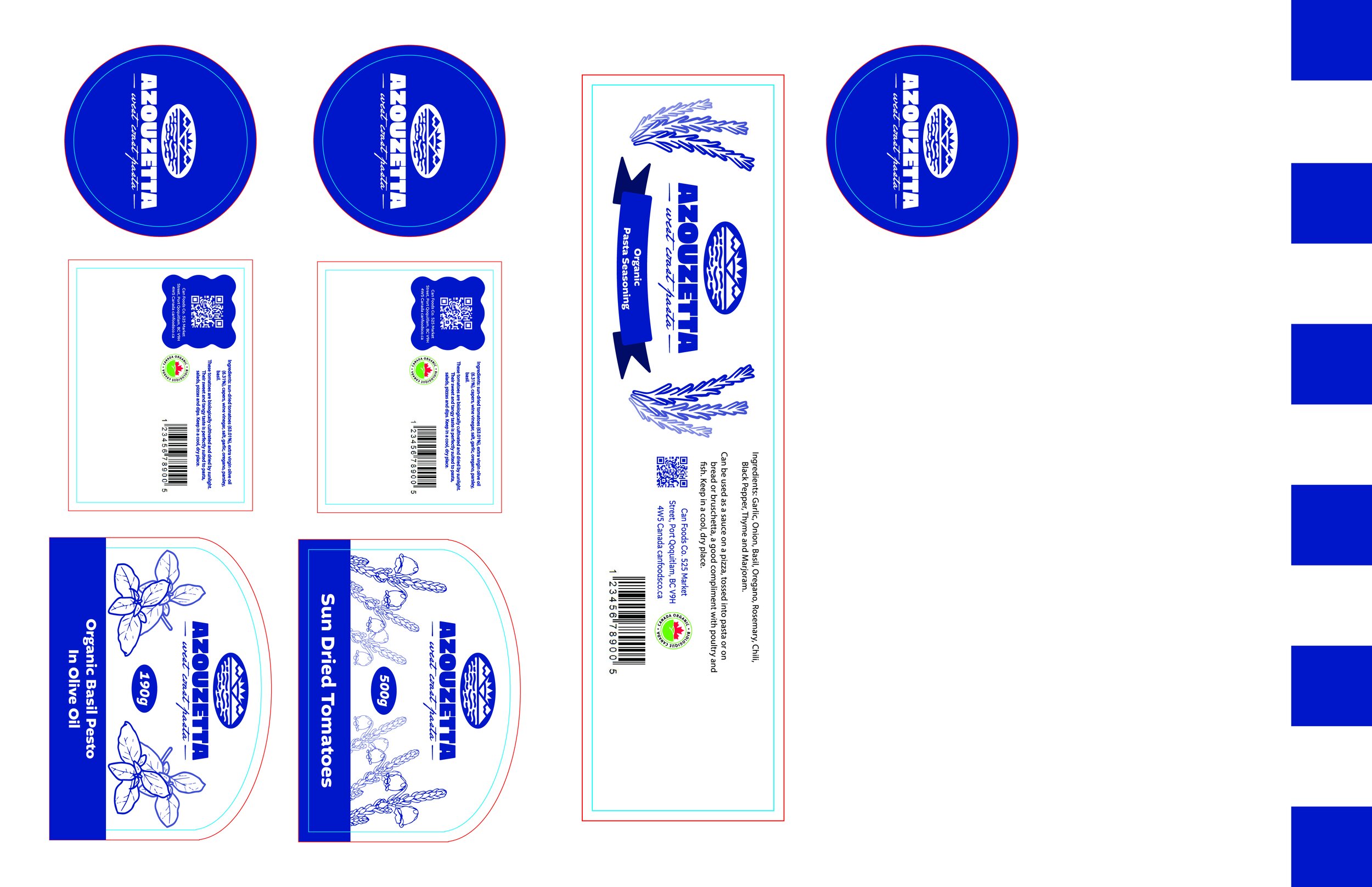
We were tasked to design a logo, branding and packaging for a fictional pasta brand based in BC. Our target audience was millennials that might be more environmentally conscious so I took the time to research different environmental landmarks around British Columbia.
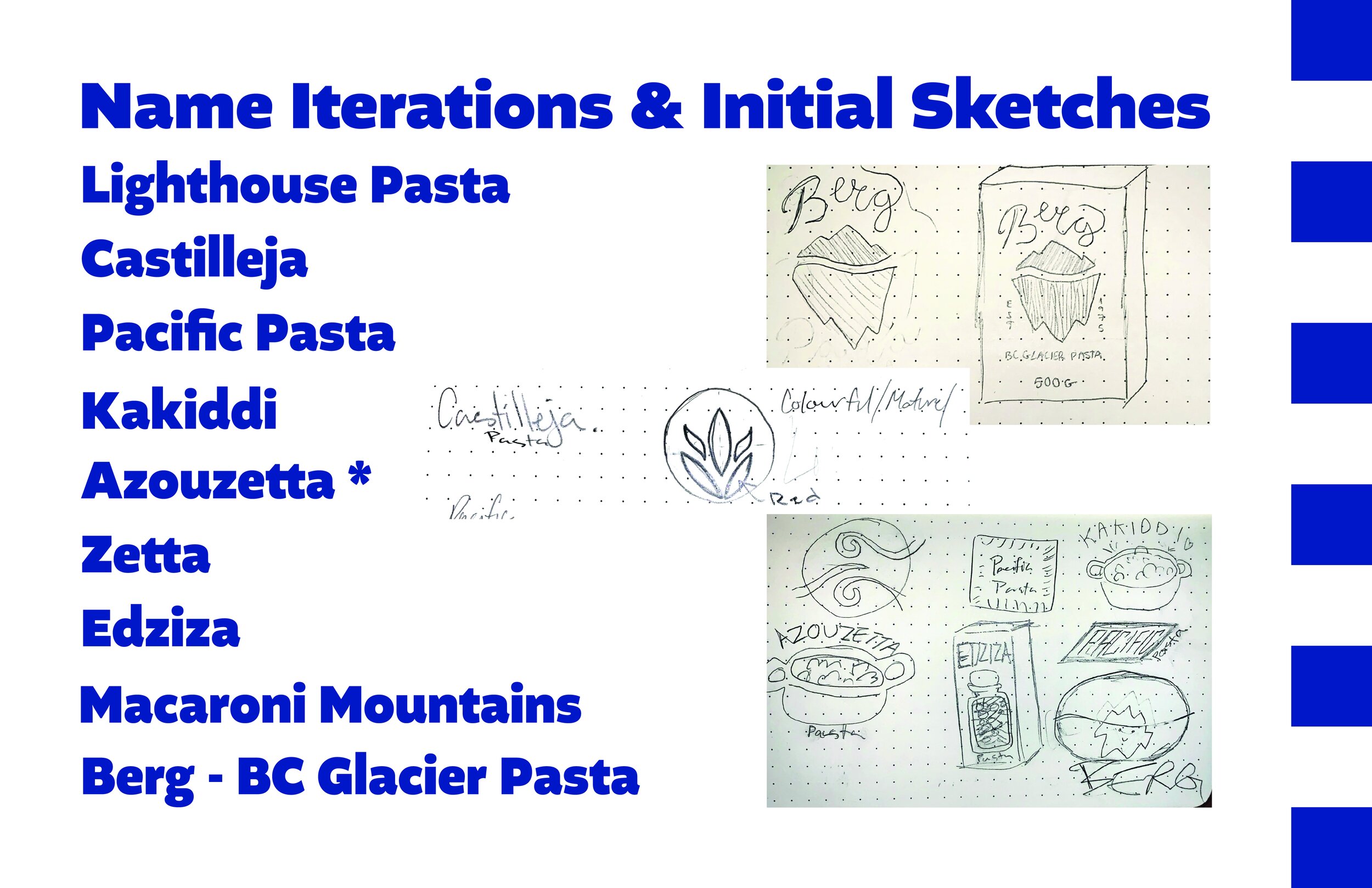
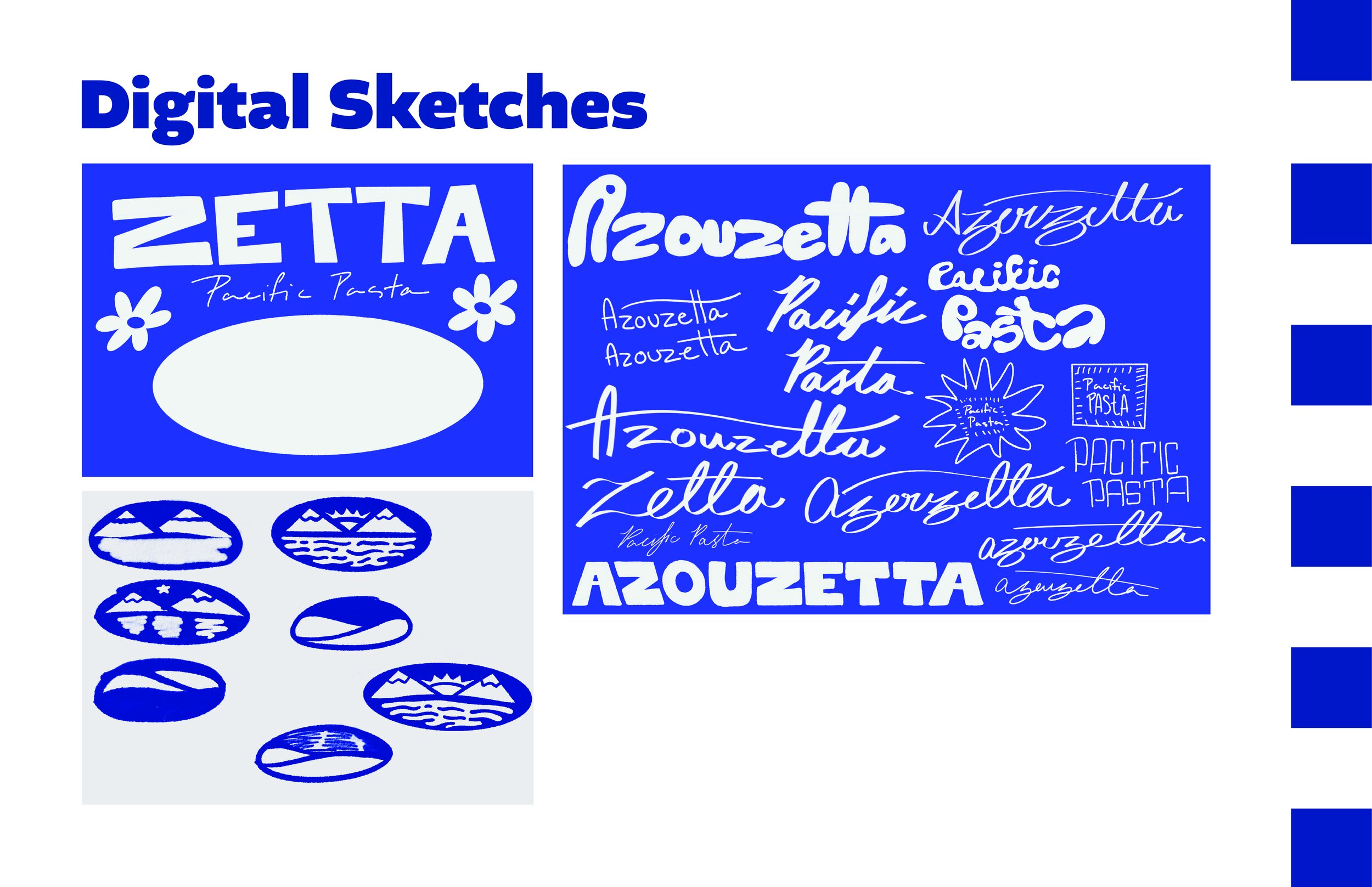
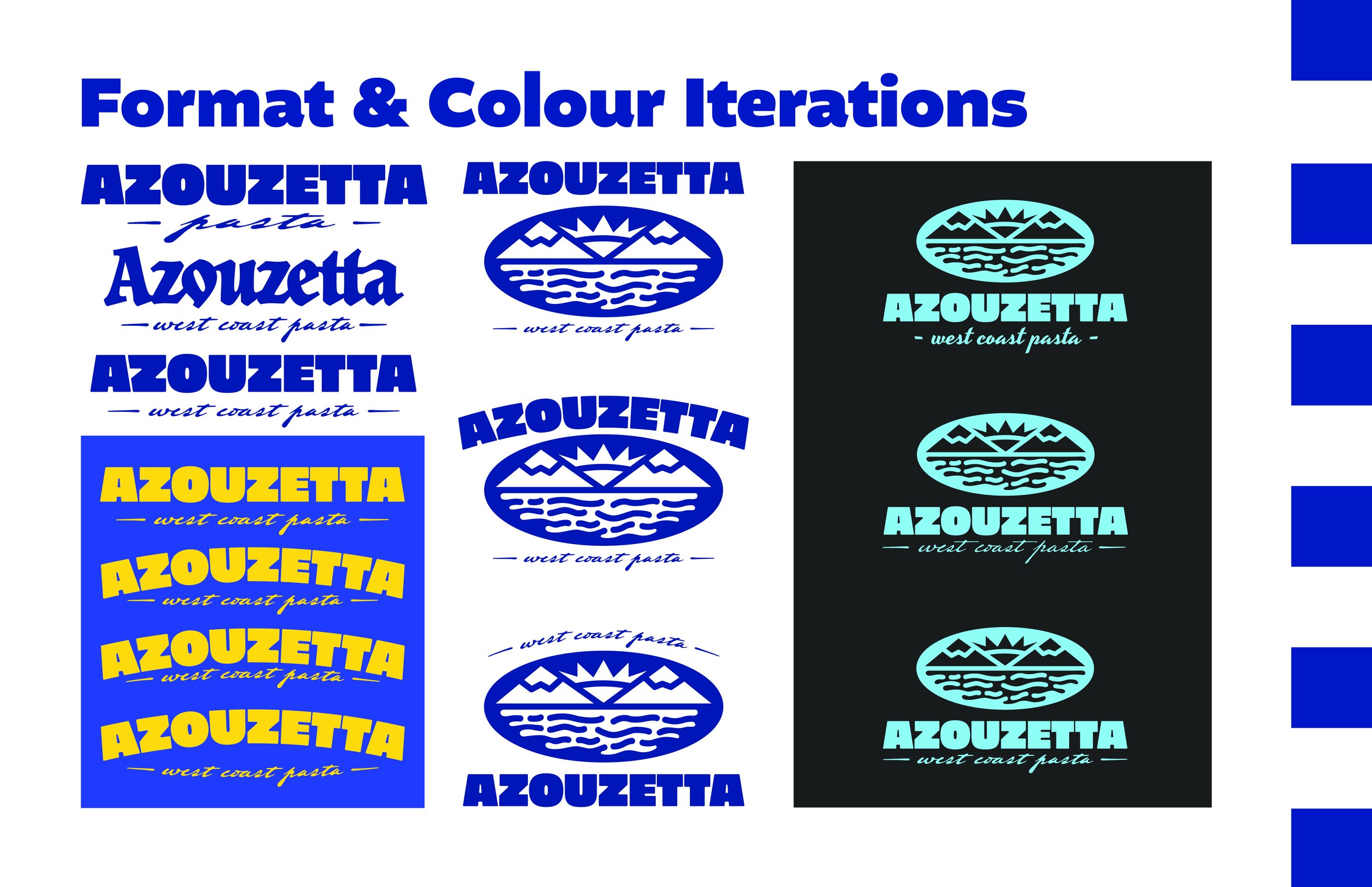
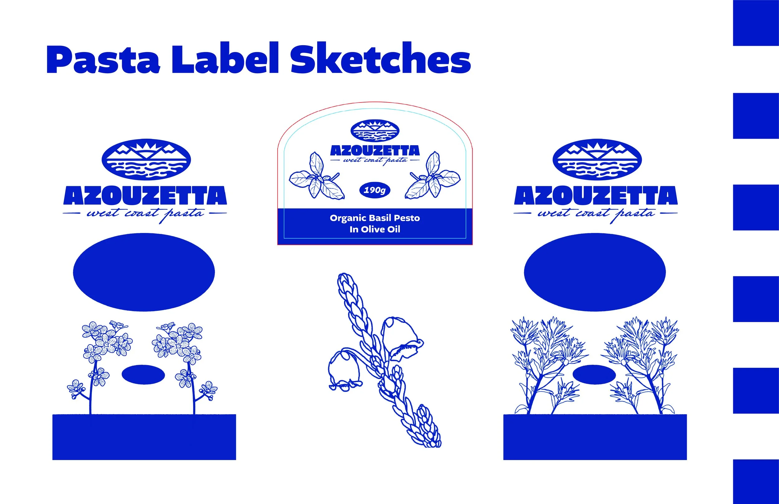
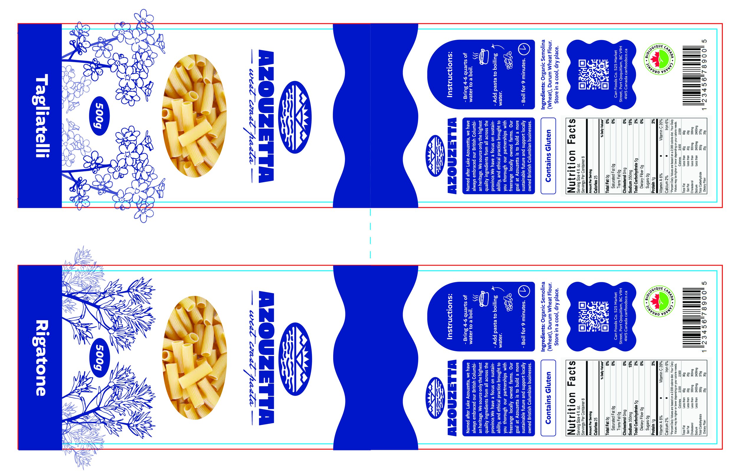
Initially I wanted to name the brand after some sort of wild flower but then found very interesting lake names around the province. Needless to say the name Azouzetta comes from Lake Azouzetta, a small sliver of water in the east-central part of the territory. The logo reflects the scenery near the lake as it’s surrounded by mountains.
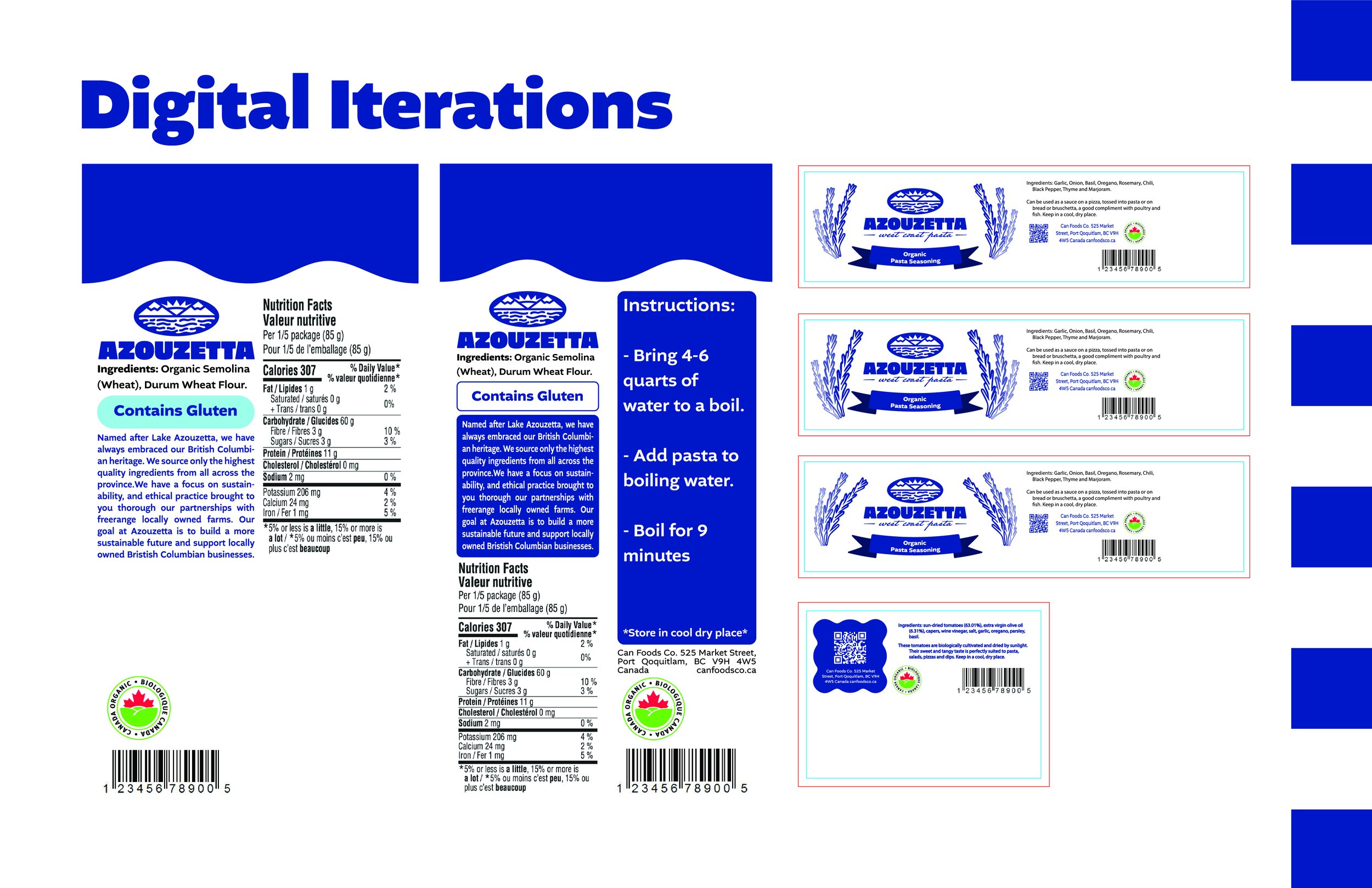
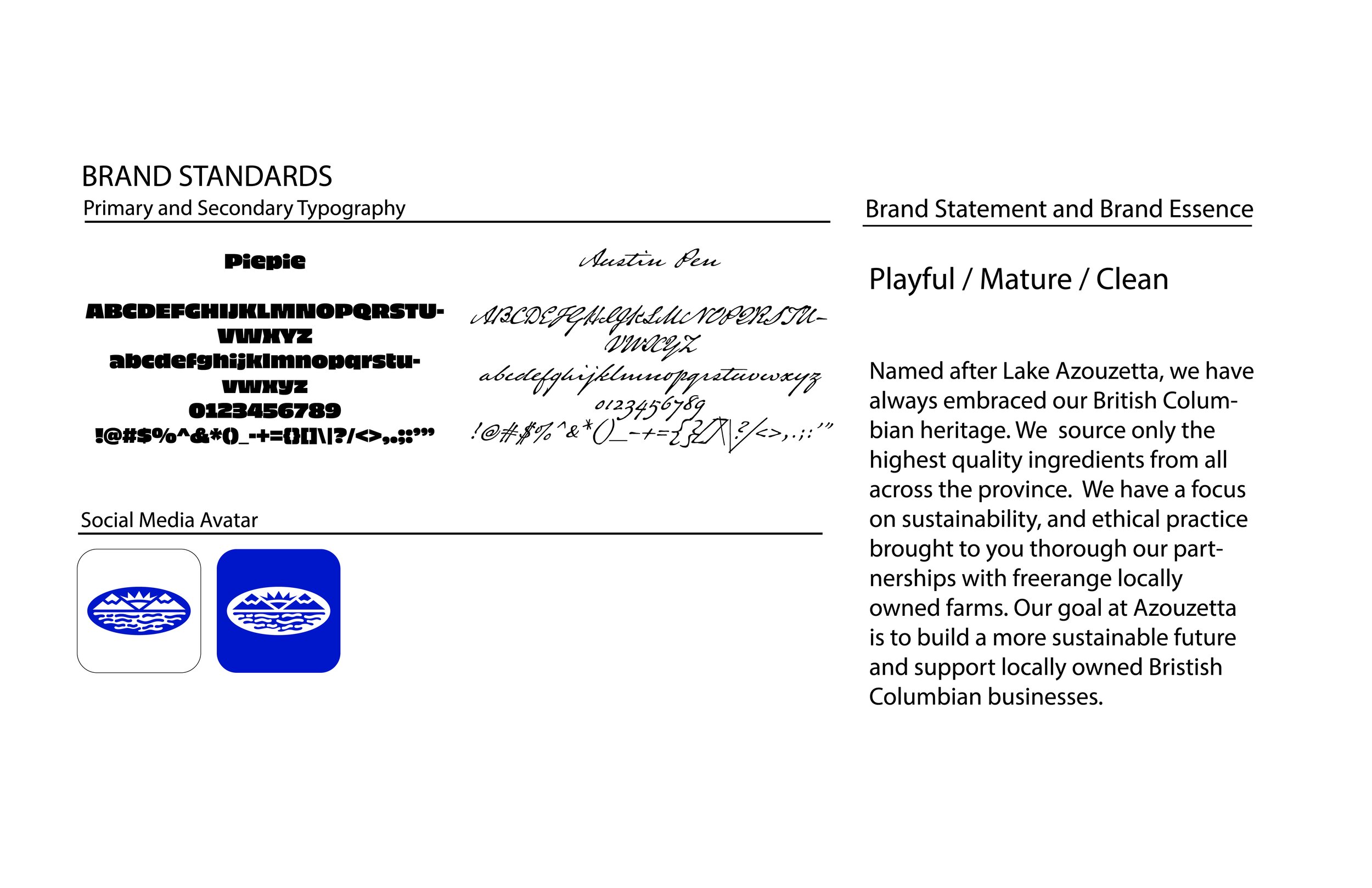
Because of the namesake I found a deep blue to be a naturally suited choice for the colour of the branding as well. In addition to this I revamped my initial idea of naming the brand after wildflowers by including hand drawn images of some native species on the packaging.